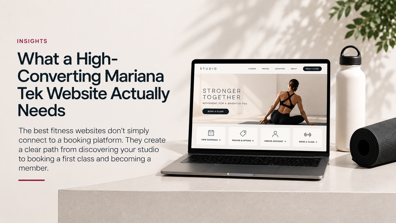
The best fitness websites don’t simply connect to a booking platform. They create a clear path from discovering your studio to booking a first class and becoming a member.
Boutique fitness websites have an unusually important job.
They need to introduce the brand, explain the experience, answer first-visit questions, communicate pricing and ultimately move someone into a booking system.
For studios using Mariana Tek, that means the marketing website and Mariana Tek experience need to work together.
A beautiful homepage won’t solve a confusing booking journey. And a technically functional integration doesn’t automatically create a strong modern boutique fitness website.
After working across hundreds of boutique fitness brands and digital experiences, we’ve found that the strongest implementations share a common principle:
The website, schedule, pricing and member account should feel like parts of one experience.
Here’s what that actually requires.
1. A Clear First-Visit Journey
Start with the person who knows almost nothing about your studio.
They may have arrived from Google, Instagram, an advertisement or a friend’s recommendation.
Within a few moments, they should be able to understand:
- What type of fitness experience you offer
- Who it’s designed for
- Where you’re located
- What a first class costs
- What they should expect
- How to book
Studios often design websites around what existing members already know.
That’s backwards.
Your website’s most important conversion journey should work for someone who has never stepped inside your studio.
A prominent First Class, New Here? or Get Started path can bring the essential information together rather than making prospective members piece it together themselves.
2. Pricing That Helps People Make a Decision
A pricing page shouldn’t simply expose every product available in your booking system.
Prospective members need context.
Consider organizing offers around the customer’s journey:
New Clients
Intro offers and first-visit options.
Memberships
Recurring options for regular members.
Class Packs
Flexible alternatives for occasional attendance.
Specialty Options
Workshops, private sessions or other studio-specific products.
The exact structure will differ by studio, but the principle remains the same:
Reduce the amount of interpretation required to purchase.
When dozens of products appear without explanation, the customer has to understand your internal product structure before they can make a decision.
That’s unnecessary friction.
3. A Schedule Designed for Discovery
Your schedule is one of the highest-intent areas of your website.
Someone viewing it is no longer simply learning about your brand. They’re considering when they can actually visit.
The surrounding experience should make it easy to understand:
- Class names
- Class types
- Locations
- Instructors
- Times
- Availability
- How to book
This becomes particularly important for multi-location brands.
A visitor shouldn’t have to repeatedly figure out which location they’re browsing as they move between the website and booking experience.
The schedule isn’t just an operational tool.
It’s a conversion page.
4. Connected Schedule, Buy and Account Experiences
Three of the most important destinations on a Mariana Tek-powered website are typically:
Schedule — What can I take?
Buy/Pricing — What can I purchase?
Account — How do I manage my experience?
These shouldn’t feel like unrelated utilities attached to the website.
Navigation, page structure and branding should make movement between them intuitive.
A prospective member might move through:
Homepage → First Visit → Pricing → Create Account → Purchase → Schedule → Book
An existing member might take a completely different path:
Website → Schedule → Login → Book
Design for both.
5. Embedded Experiences That Maintain Context
Sending someone away from the branded website during a high-intent action can create unnecessary friction.
A prospective member might discover your studio on Instagram, visit your website, review pricing, create an account and book a class without ever opening a laptop. That’s why fitness websites should be designed mobile-first.
That allows the brand to maintain supporting elements such as:
- Navigation
- Location context
- Helpful instructions
- Consistent visual presentation
- Relevant calls to action
The objective isn’t embedding something simply because it can be embedded.
It’s maintaining continuity throughout the member journey.
6. Visual Consistency Between Systems
Members generally don’t care which technology is powering each part of their experience.
They simply experience the brand.
Typography, colors, spacing and surrounding website elements should therefore work together as consistently as the underlying systems allow.
If a polished homepage suddenly transitions into something that feels completely unrelated, users notice even if they don’t know why.
Strong integrations reduce that visual disconnect.
Your technology should support the brand rather than becoming the brand.
7. Mobile-First Booking
A prospective member might discover your studio on Instagram, visit your website, review pricing, create an account and book a class without ever opening a laptop.
The entire journey needs to work on a small screen.
That means testing more than whether individual pages technically respond to mobile.
Walk through the actual conversion flow:
Discover → Learn → Select Location → View Offer → Register → Purchase → Find Class → Book
Look for:
- Unnecessary scrolling
- Difficult navigation
- Small interaction targets
- Content obscuring booking functionality
- Confusing location changes
- Repeated steps
- Hard-to-find actions
Mobile optimization should include the booking journey, not just the marketing pages.
8. Strong Location Architecture
Multi-location brands introduce another layer of complexity.
Your website needs to make the relationship between brand-level and location-level information obvious.
A useful location page can bring together:
- Location-specific introduction
- Address
- Amenities
- Class offerings
- Instructors
- Intro offer
- Pricing
- Schedule
- Contact information
- Local FAQs
From there, someone should be able to enter the appropriate Mariana Tek journey without losing location context.
Well-structured location pages also create a stronger foundation for local SEO for boutique fitness studios.
9. Searchable Content Outside the Booking Experience
Your booking platform shouldn’t have to carry your entire SEO strategy.
Important information should also exist as useful website content.
That includes dedicated content around:
- Classes
- Locations
- Instructors
- First visits
- Amenities
- Training methodologies
- Frequently asked questions
The goal isn’t to create pages simply for search engines. Better studio content should answer real prospective-member questions while clearly communicating what makes the experience different.
This helps prospective members understand your offering before entering the transaction flow while giving search engines and emerging AI discovery systems more context about the business.
The website explains.
The booking experience transacts.
They should support each other.
10. Website Performance
Every additional integration, tracking script, marketing tool, image and third-party service adds something to the website.
Sometimes it also adds weight.
A modern fitness website should continually consider:
- Image optimization
- Script loading
- Font delivery
- Plugin overhead
- Caching
- Hosting
- Core Web Vitals
- Third-party integrations
Speed becomes especially important when someone moves between marketing content and embedded functionality on mobile.
We’ve covered in more detail how website speed can impact fitness studio conversions, but the principle is simple: every unnecessary delay adds friction to an already high-intent journey.
Performance isn’t simply an SEO metric.
It’s part of conversion.
11. Analytics Around the Actual Journey
Traffic alone doesn’t tell you whether a website is working.
The more useful questions are:
Are visitors reaching pricing?
Are they viewing the schedule?
Are they starting the registration process?
Are they reaching the purchase experience?
Which pages are helping move people there?
The objective is to understand the path between acquisition and conversion—not simply celebrate pageviews.
Studios should establish measurement around the actions that matter to their business.
12. A Real Pre-Launch Test
Before launch, someone should experience the website as a customer rather than an administrator.
Don’t just check pages.
Complete journeys.
Try:
Google → Location → Intro Offer → Purchase → Schedule → Book
Then:
Homepage → Class → Instructor → Schedule → Book
Then:
Mobile → Pricing → Account → Login
Then test it again as an existing member.
Look for anything that creates uncertainty:
Where am I?
Which location am I viewing?
What should I buy?
Do I already have an account?
What happens next?
Those questions reveal problems that a standard page-by-page QA process can miss.
The Website Is Part of the Mariana Tek Experience
A high-converting Mariana Tek website isn’t simply a beautiful marketing site with booking functionality attached to it.
It’s a connected digital member journey.
The brand attracts attention.
The website creates understanding.
Pricing helps someone make a decision.
The account connects them to the ecosystem.
The schedule gets them into class.
And the experience continues from there.
Every unnecessary click, confusing transition or missing piece of information introduces friction between discovery and that first class.
The goal is simpler:
Make it easy for someone to discover your studio, understand what you offer, choose the right option and book.
When the website and Mariana Tek work together around that goal, the technology gets out of the way—and the studio experience can take over.